Works
8 Projects
-
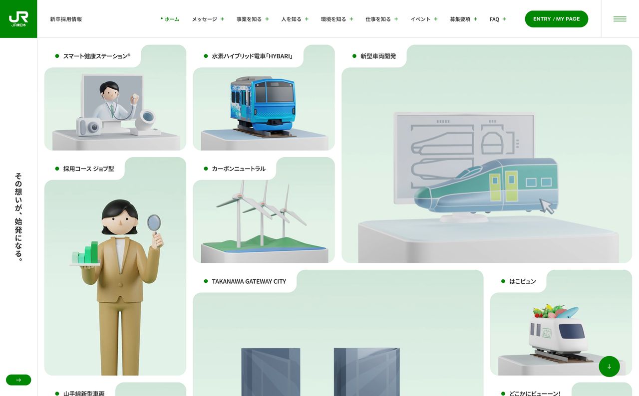
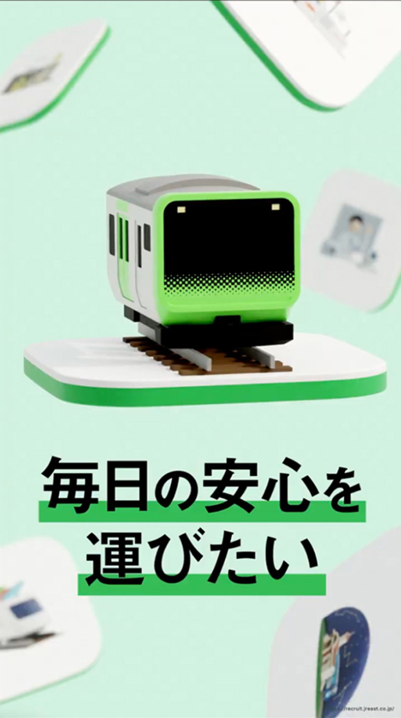
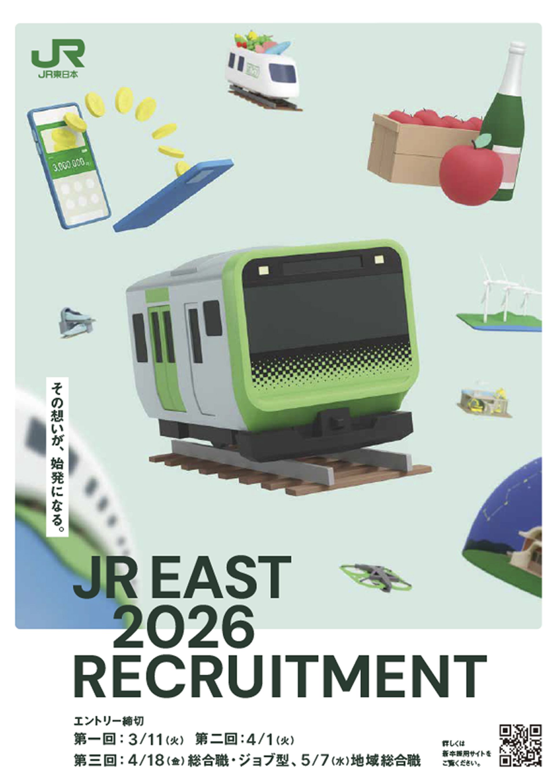
JR EAST New Graduation
RecruitmentEast Japan Railway Company
- Website
- Movie
- Graphics
JR EAST New Graduation
RecruitmentEast Japan Railway Company
- Website
- Movie
- Graphics
HANEDA
Japan Airport Terminal Co., Ltd.
- Motion
JR EAST New Graduation
RecruitmentEast Japan Railway Company
- Website
- Movie
- Graphics
JR EAST New Graduation
RecruitmentEast Japan Railway Company
- Website
- Movie
- Graphics
-


DriveFlux LP
Morisawa Inc.
- Website
DriveFlux LP
Morisawa Inc.
- Website
Osaka Metro
Osaka Metro Co., Ltd.
- Motion
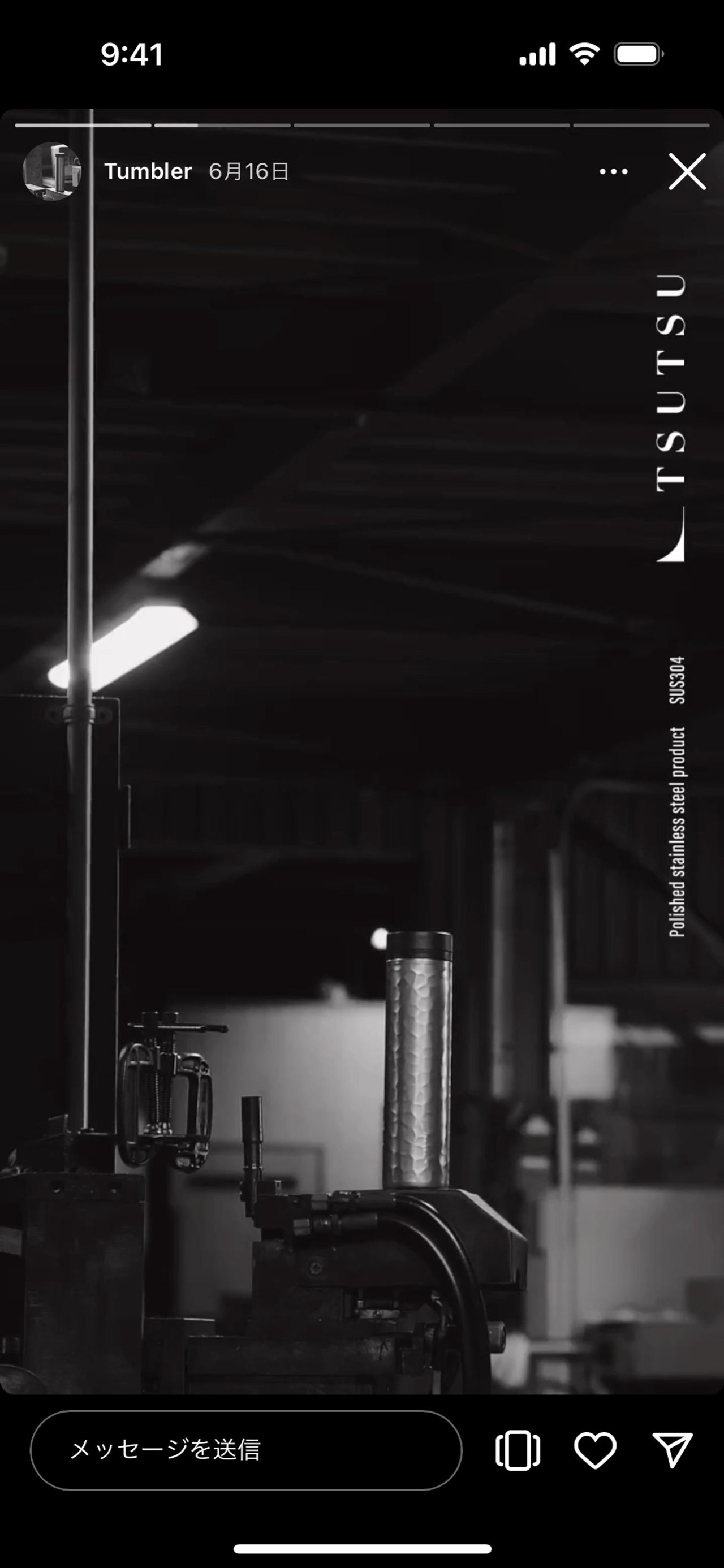
TSUTSU
SUS Inc.
- Website
- Movie
Sansan Mid-career Recruitment
Sansan, Inc.
- Website
- Graphics
-
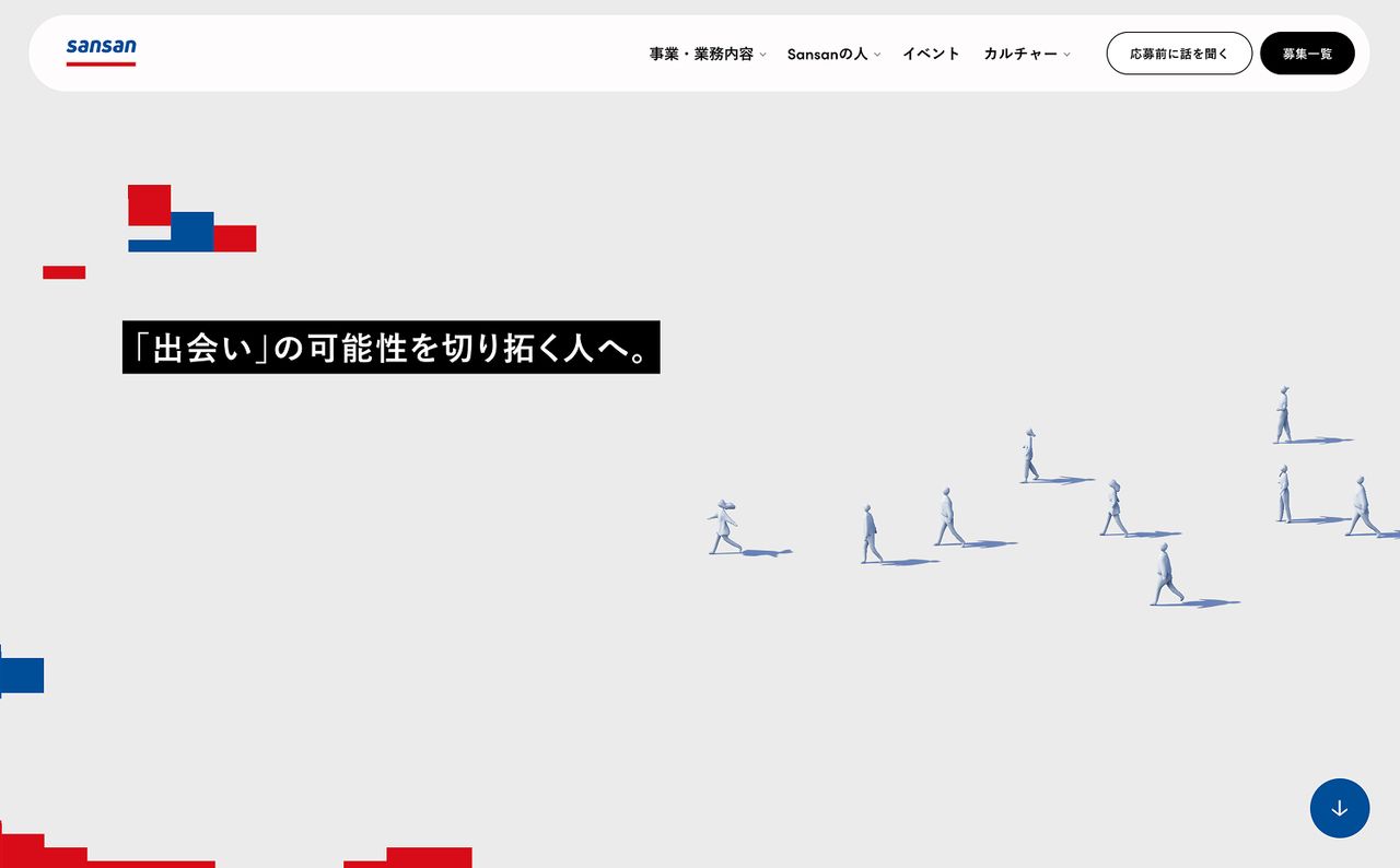
Sansan Mid-career Recruitment
Sansan, Inc.
- Website
- Graphics
Sansan Mid-career Recruitment
Sansan, Inc.
- Website
- Graphics
JR EAST New Graduation
RecruitmentEast Japan Railway Company
- Website
- Movie
- Graphics
DriveFlux LP
Morisawa Inc.
- Website
Sansan Engineering Division
Sansan, Inc.
- Graphics
- Website
-
HANEDA
Japan Airport Terminal Co., Ltd.
- Motion
Kowloon Type
Kowloon Type
- Website
DriveFlux LP
Morisawa Inc.
- Website
Sansan Mid-career Recruitment
Sansan, Inc.
- Website
- Graphics
DriveFlux LP
Morisawa Inc.
- Website
-

Kowloon Type
Kowloon Type
- Website
TSUTSU
SUS Inc.
- Website
- Movie
Sansan Mid-career Recruitment
Sansan, Inc.
- Website
- Graphics
HANEDA
Japan Airport Terminal Co., Ltd.
- Motion
HANEDA
Japan Airport Terminal Co., Ltd.
- Motion
-
TSUTSU
SUS Inc.
- Website
- Movie
Sansan Engineering Division
Sansan, Inc.
- Graphics
- Website
Kowloon Type
Kowloon Type
- Website
Kowloon Type
Kowloon Type
- Website
Kowloon Type
Kowloon Type
- Website
-
Sansan Engineering Division
Sansan, Inc.
- Graphics
- Website
HANEDA
Japan Airport Terminal Co., Ltd.
- Motion
TSUTSU
SUS Inc.
- Website
- Movie
Sansan Engineering Division
Sansan, Inc.
- Graphics
- Website
TSUTSU
SUS Inc.
- Website
- Movie
-
Osaka Metro
Osaka Metro Co., Ltd.
- Motion
Osaka Metro
Osaka Metro Co., Ltd.
- Motion
Sansan Engineering Division
Sansan, Inc.
- Graphics
- Website
Osaka Metro
Osaka Metro Co., Ltd.
- Motion
Osaka Metro
Osaka Metro Co., Ltd.
- Motion


